正月っぽいReactiveのCSS
Discordの正月っぽいReactiveのCSSを実装してみたので共有します.
これをReactiveを読み込んでいるブラウザのカスタムCSSに適応します.
.flex[style*="aspect-ratio: 4 / 1"] {
  background: linear-gradient(135deg,
    #b71c1c 0%,
    #c62828 50%,
    #b71c1c 100%);
  position: relative;
  gap: 0.5rem;
  padding: 0 0.5rem;
}

.flex[style*="aspect-ratio: 4 / 1"]::before {
  content: '';
  position: absolute;
  inset: 0;
  background-image:
    radial-gradient(circle at 15% 30%, rgba(255, 215, 0, 0.4) 2px, transparent 2px),
    radial-gradient(circle at 85% 70%, rgba(255, 215, 0, 0.4) 2px, transparent 2px),
    radial-gradient(circle at 50% 15%, rgba(255, 215, 0, 0.3) 2px, transparent 2px),
    radial-gradient(circle at 25% 85%, rgba(255, 215, 0, 0.3) 2px, transparent 2px);
  pointer-events: none;
  z-index: 0;
}

.flex > div[data-discord-id] {
  z-index: 1;
}

.flex > div[data-discord-id] > .relative::after {
  content: '';
  position: absolute;
  inset: 0;
  border: 3px solid #ffd700;
  border-radius: 50%;
  box-shadow:
    0 0 0 2px #8b0000,
    0 0 12px rgba(255, 215, 0, 0.5);
  pointer-events: none;
  z-index: 20;
}

.flex > div[data-speaking="true"] > .relative::after {
  border-color: #fff;
  box-shadow:
    0 0 0 2px #ffd700,
    0 0 20px rgba(255, 215, 0, 0.8),
    0 0 35px rgba(255, 200, 100, 0.5);
  animation: speaking-glow 1.2s ease-in-out infinite;
}

@keyframes speaking-glow {
  0%, 100% {
    box-shadow:
      0 0 0 2px #ffd700,
      0 0 20px rgba(255, 215, 0, 0.8),
      0 0 35px rgba(255, 200, 100, 0.5);
  }
  50% {
    box-shadow:
      0 0 0 3px #ffd700,
      0 0 30px rgba(255, 215, 0, 1),
      0 0 45px rgba(255, 200, 100, 0.7);
  }
}

.flex > div[data-muted="true"] > .relative::after {
  border-color: #888;
  box-shadow: 0 0 0 2px #555;
  opacity: 0.7;
}

.flex canvas {
  border-radius: 50%;
}
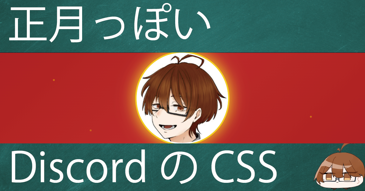
イメージ画像
